
The SCHIRN is calling for a new peace logo. As part of the exhibition Peace, which will run at the SCHIRN from June 30 to September 24, the time has come for a new peace symbol, “a logo for our time that illustrates our concept of peace today,” says Director Dr. Philipp Demandt. The exhibition does not tackle the peace and Hippie movement like so many others, but rather asks specifically: How does peace actually work?
Yet first of all, how does a logo like this actually work? What do you need to take into account when you design a new logo and can you design a symbol so that it acquires universal validity internationally? These were the questions SCHIRN MAGAZINE put to Burkhart von Scheven, Professor of Visual Communication and Image-Text Concepts at the Bauhaus University in Weimar. Alongside his professorship, Scheven is also Managing Director of his own agency, Aufbruch-Scheven-Kroke, in Düsseldorf. He spent six years as creative director at Saatchi & Saatchi Germany and prior to that spent seven years at Jung von Matt. Burkhart von Scheven has received several hundred national and international prizes, including seven Cannes Lions. He is a member and juror of ADC and was appointed to the Cannes jury in 2011.
SCHIRN MAGAZINE: What do you think of the supposedly best-known peace symbol, the CND logo?
Professor Burkhart von Scheven: It is strong, recognizable and works internationally and interculturally, but it’s lacking something in terms of emotion. The rainbow or the white dove evoke stronger emotions, but they don’t have the same international validity.
SM: How do you actually go about charging logos with emotion?
BS: One good way is with emotional quotations or symbols. Examples include the white dove here too, or the shattered gun. In actual fact emotions are always roused when you employ images or use colors that are charged with certain emotions. However, it always depends on the context.
SM: Are there colors that have universal validity worldwide?
BS: There are always cultural differences. At the same time it is already internationally applicable that blue and green color schemes are allocated to more technical areas and warmer colors such as red and orange are applied to more emotional themes. Despite this, almost every color has also already been used in very different contexts and in each case dominated by them. There is no one color with unequivocal value.
SM: Let’s come back to the logo. If I wanted to design a new one, what would I have to take into account? What are the steps you take in your approach?
BS: The logo is the heart of the visual identity of a company, an institution or, as here, an initiative, an exhibition. And that’s precisely where you need to start. Firstly you need to understand the bearer of this heart from the ground up: What does this company, this initiative want to achieve and what type of personality are you dealing with? What does its brand stand for?
Aside from this there are of course rules and guidelines. The logo should be presented so that it corresponds to the attributes and values of the brand. It should be timelessly relevant, because you shouldn’t want to or have to modify it continually. It should radiate seriousness and internationality too, and should combine simplicity of understanding with ease of use. The more compact a logo is, the more universally I can apply it. When in doubt I like to ask whether I could print a logo with equal effectiveness on a biro and on a running elephant. It has to be usable! I have to ask myself: How can I say what I want to express, but so that it still remains functional as a logo?
Embedded Image via publishistory.wordpress.com
SM: What should be avoided at all costs when designing logos?
BS: Logos should not become too delicate or complex, and I believe neither should they be too colorful, but rather unequivocal and recognizable in their form and color. The exceptions confirm the rule, such as the Google logo, which is not only very colorful but also changes its design time and again. Individual national influences should be avoided, as should technical limitations that mean a logo can only be implemented with specific production processes, for example if it can only be printed but not projected, or it cannot be placed on certain backgrounds or colors.
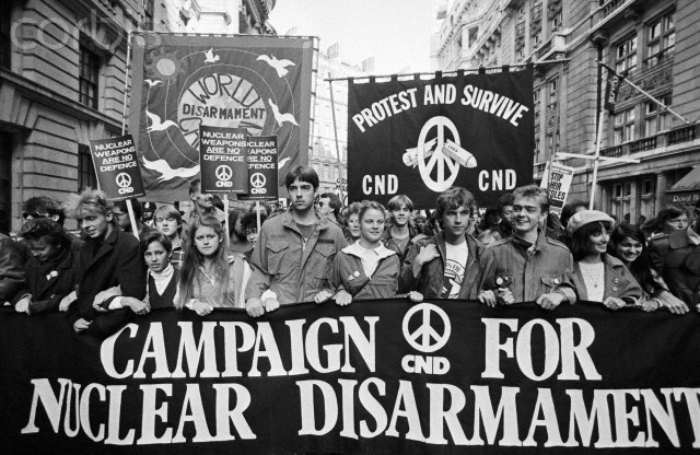
SM: The CND peace logo has become a globally applicable symbol. Can you plan for this sort of international success in the design or is it merely chance?
BS: The context always plays an important role. When the artist Gerald Holtom designed the peace symbol, it was a commission from the British Campaign for Nuclear Disarmament (CND). It related quite specifically to the Cold War and nuclear weapons, and the peace logo stood quite clearly for the opposite, for nuclear disarmament. This logo fed into a global political climate in which the theme it stood for was a popular one, and this context made the CND logo extraordinarily strong. If the same logo had been used at the same time for something different – for a coffee-roasting company, for example – then it wouldn’t have had the same success. The context is undoubtedly also an accident of the times, but plays an important role. Of course a strong design is extremely important too though. A logo must have symbolic power, behind which a community can gather and willingly carry it before them.

CND campaign, Embedded Image via pinterest.com
SM: Can logos have power? Specifically in the context of political movements? Or do they always remain aesthetic accoutrements?
BS: Logos can be given unbelievable power, but it is not inherent within them. A poorly designed, unclear, fragmenting logo will never be powerful. However there are also strong, reduced, clear logos that will never have power because they do not stand for anything powerful. When I create a logo for a lighter manufacturer then it will never gain huge power. In contrast, a logo for a political movement always has the basic potential to become powerful.
Around 15 years ago I came across a classic print advertisement in a magazine in the USA: double spread, red font, white circle in the middle and in it a black cross, a swastika. I had to catch my breath! The caption read: Never underestimate the power of a strong image. It was an advert by and for an American advertising agency, and it demonstrates how powerful a logo can be. Around 70 years after it emerged you are still floored by it when you come across it. Yet the power of this logo only developed as a result of the history associated with it.
SM: Can logos also come from fashions?
BS: They certainly can, in design terms most definitely. It’s not for nothing that logos of big companies are regularly reviewed and updated. The trend over the last few decades has been to make logos more and more reduced.

Google logo development, Embedded Image via 2x4.org
SM: Why might it be that the peace logo is now not as present or out of fashion? There are surely enough political tensions and thus enough reasons to display it again?
BS: It’s true that the peace logo is no longer as present as it was during the 1980s. We can only speculate as to why that is. It could be down to a sense of belonging being ever less prevalent. We are seeing how Europe is drifting apart and consequently there is a lack of will to unite behind a common logo.
Perhaps we simply need to bring the old logo back into play again and reinterpret it. A digital version was never developed, for example; there is no CND logo as a moving image or as a three-dimensional animation. The CND logo is simply a static thing that has not been tackled for a long time. It would be great to revive it, but it would be equally exciting to establish an entirely new logo, as is currently being initiated by the SCHIRN. It’s an enormous task, but the process is incredibly interesting.
VW logo development, Embedded Image via evolutionofthelogos.weebly.com
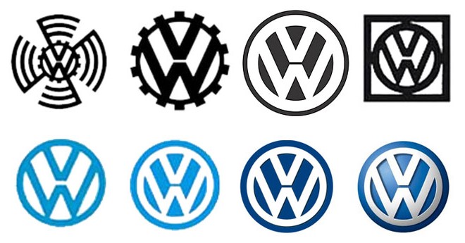
SM: From a purely design perspective there are certainly fashions. Can you give any examples from the last few decades?
BS: Two trends come to mind. Around 20 years ago many companies started presenting their logos three-dimensionally. For example the VW logo: It was no longer flat, but was suddenly curved and in sophisticated materials, so appeared more upmarket. This trend continued for around ten years, and then the development was reversed. Many of these three-dimensional logos have once again become two-dimensional. The same could be seen with cell-phone interfaces. The first graphic Apple user interfaces were haptic, three-dimensional, with curves and specularity. Now a two-dimensional design – a flat format – and a purist style have taken over. Soon there will no doubt be another counter-movement.
SM: Is an emotionally charged logo more important in political movements than with a product logo?
BS: Every logo always has an emotional value, even if the object of the logo is somewhat cold. The political logos of our German federal parties, for example, are not particularly appealing in their design and are often just three letters. The Pirate Party was more daring and integrated a flag. Immediately the logo / the party appears more playful and approachable. However, you can’t generalize this difference. With baby food, for example, values such as empathy and trust are very important and should be expressed even in the logo itself.
SM: Last but not least, do you have a favorite logo?
BS: My favorite logo is that of FC Schalke 04.
SM: Mr von Scheven, thank you for talking to us!
FC Schalke 04, Embedded Image via wikipedia.org