

Peace has many faces, at least as regards its symbols. However, they have always been connected with war: When, back in 1958, Brit Gerard Holtom designed the globally familiar peace symbol with the three downward pointing lines he did so as part of the “Campaign for Nuclear Disarmament”. Similarly, the rainbow flag design in the early 1960s in Italy, and to which later the word “PACE” was added, came about as a direct response of the peace movement to global nuclear armament.
That said, do we need war and destruction in order to create peace? Is peace really only the absence of war? And what would a peace symbol look like that incorporates all the aspects? Independently of each other Paul Müller from Germany and Bekata Ozdikmen from Turkey both hit on the same idea: It has to be a simple, blue dot.
The greatest possible abstraction
“No doubt this very simple design will meet with a lack of understanding in many places. How can such a simple logo represent a topic that is as complex as peace? However, it was the very complexity of the subject that led to the choice of such a reduced symbol. Attempting to include all the aspects of peace in a simple image is as impossible as trying to count the grains of sand on the beaches of this world. The blue dot is the greatest conceivable abstraction of the Earth,” says Paul Müller to explain his idea.


The thinking behind his design: The peace logo needs to stand for a utopia in which peace exists between all states, the genders, all people and creatures in general. Naturally, this also includes peace with nature. But the dove of peace has to be ruled out as a universal symbol, because it has its roots in the Christian bible, and is not readily comprehensible for all cultures. Similarly, the white flag seems unsuitable in this situation as it very definitely originates from a military context.
Part of the universe
But why a dot of all things? “The circle is the most natural shape, as both the smallest and the largest parts of our universe are round. A square logo might also make sense if you particularly wish to emphasize the fact that in absolute form peace can only exist as a utopia,” argues Paul Müller, who still goes to school, and would like to study visual arts after taking his school-leaving certificate.

Dove of peace, Public Domain Via Wikipedia
Bekata Ozdikmen from Istanbul, who also submitted a blue dot, followed a similar line of reasoning. “Certain things already have a set shape. For example, when I say ‘apple’ nobody would think of a rectangular shape in blue, but rather of something red and round. The first thing that springs to mind when you think of the Earth is a blue circle.”
The world just before the explosion
The competition immediately appealed to the Turkish graphic designer for personal reasons, as he was born in 1965, and sees himself as a child of the “1968 Generation” in which the old peace symbol had a special meaning. For the younger generation this symbol no longer has the same impact, says Ozdikmen – and that in an age in which the world seems like a time bomb swiftly ticking away.
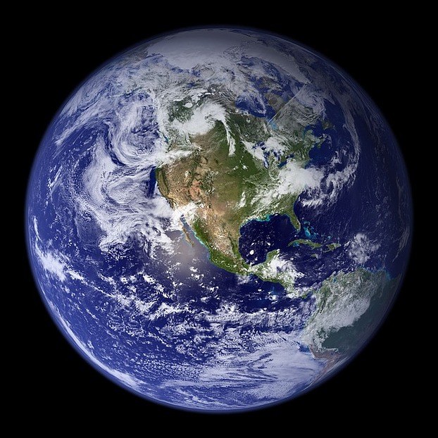
Earth from above, Public Domain via Pagewizz
His logo design refers to the fact that the earth’s surface is largely covered by areas of water for which national boundaries play no role: An Earth on which we are only guests, and which we should therefore defend with all available means rather than willfully destroying it. Another reason for him opting – like many of the contestants – for a round shape is its dynamism, which brings us round full circle.