GET INSPIRED BY THE MOOD OF A CANADIAN INDUSTRIAL LANDSCAPE AND COMPLETE A PAINTING WITH YOUR OWN DRAWING
NATURE FULL OF TREASURES
BLEAK OR CHEERFUL?
About the exhibition MAGNETIC NORTH. In the works of the artists around the so-called Group of Seven, the beauty of Canadian nature is often celebrated. However, there are also works that address its exploitation. Some of them show areas that have been severely altered by the industrial extraction of mineral resources, such as metals that lie deep underground in mountains.
THE POINT WAS NOT ONLY TO REPRESENT A CONCRETE LANDSCAPE, BUT ALSO TO REPRESENT A PARTICULAR MOMENT
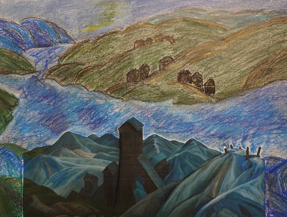
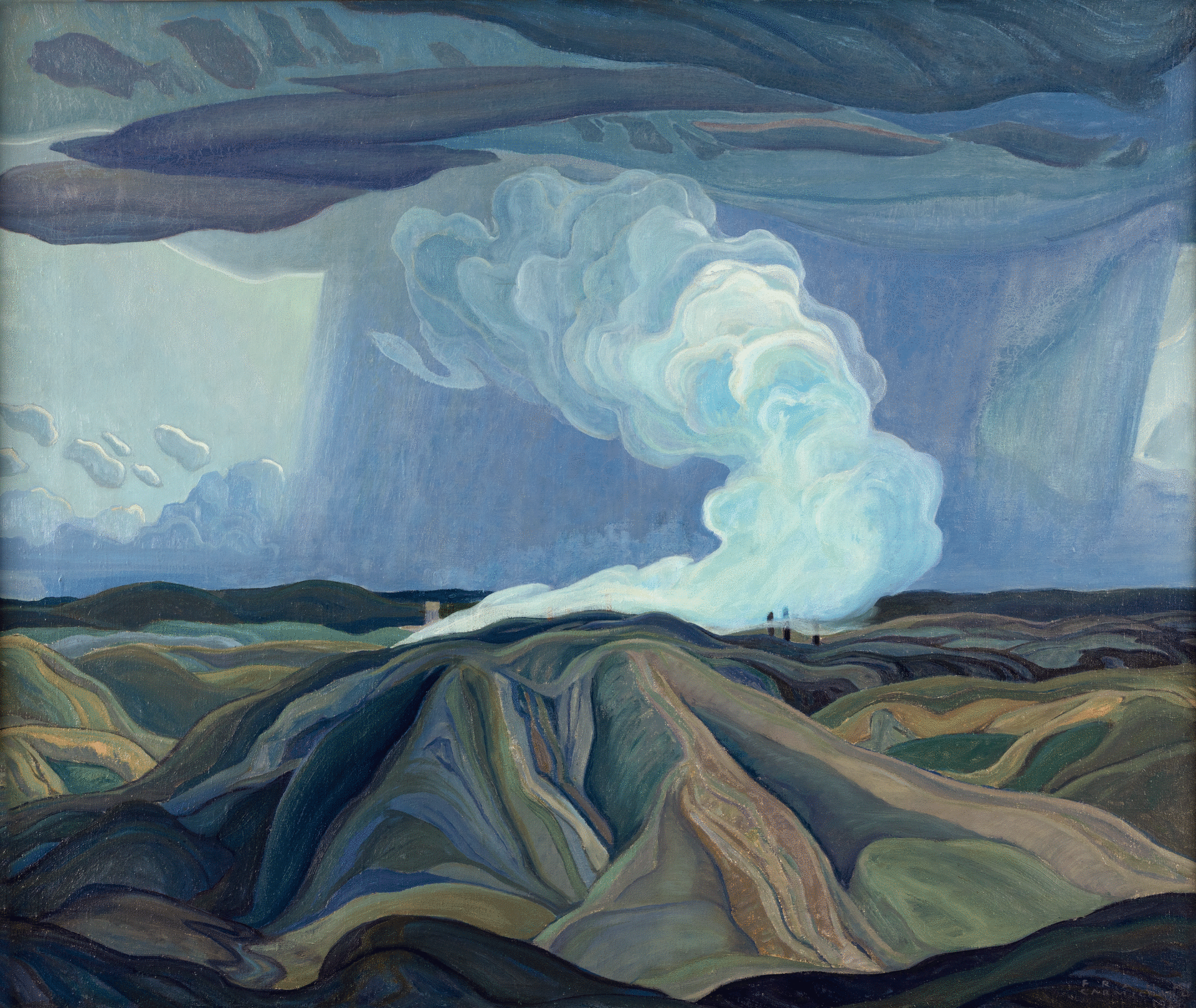
Franklin Carmichael's painting shows a mining region in Northern Ontario where silver was mined. A river in the middle section of the painting seemingly separates the deserted industrial landscape into two parts. The tall, dark mining towers in the foreground, rising above cold and artificial-looking hilltops, appear joyless. Dominated by green-yellow hills with residential houses, however, the landscape on the other side of the river looks friendlier.
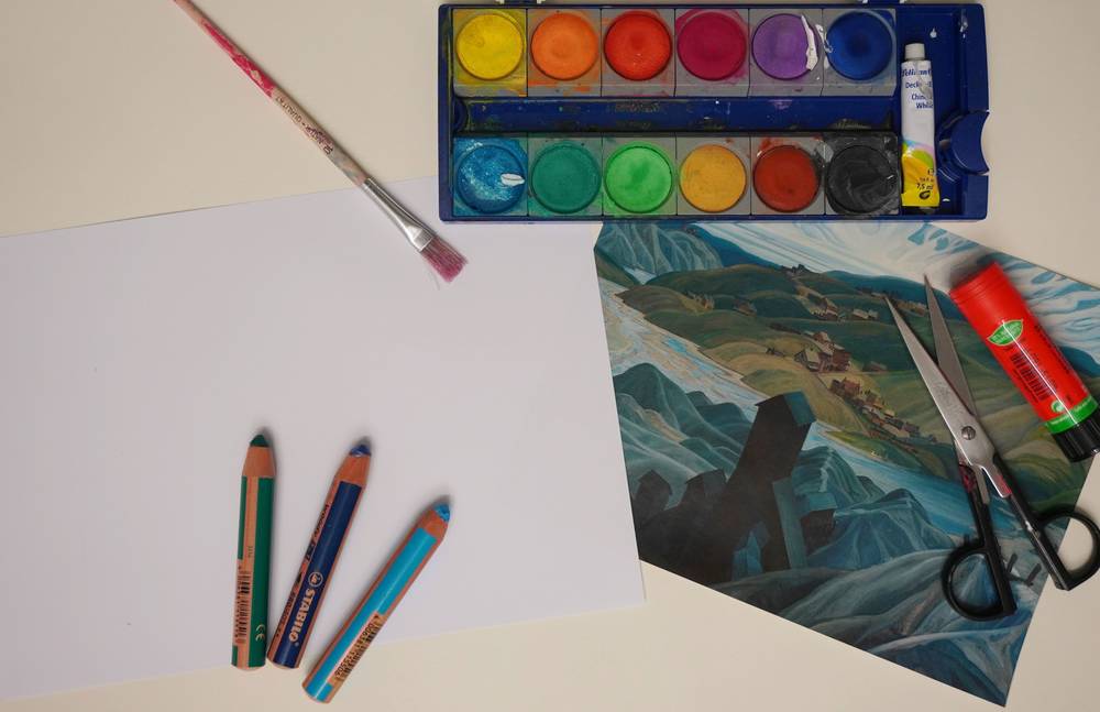
YOU NEED: COLOR PRINT OF "A NORTHERN SILVER MINE", SOLID DRAWING PAPER (DIN A4 OR A3), SCISSORS AND GLUE, WATERCOLORS WITH BRUSHES, WOODYS AND/OR WAX CRAYONS
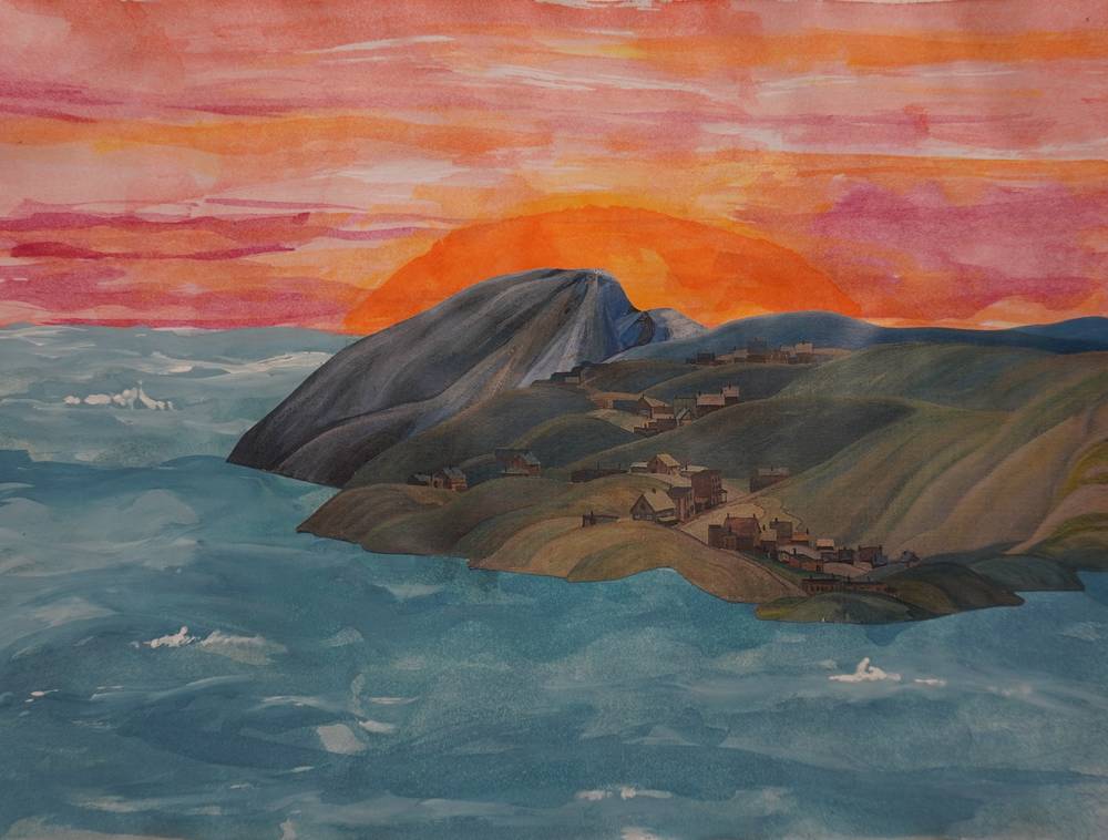
Another way to engage with the image and its moods is to change the surroundings or omit parts of them. In the picture carousel, discover how different the picture looks when the dark foreground with the mining towers and the mountain peaks is not shown.
TIP
- Are there abandoned industrial areas in your neighborhood, on the outskirts of the city or town where you live? These can be abandoned warehouses or old factories that are no longer in operation. These buildings often look colorless, dark and sad. Take a photo of it, print it out, and think about how you can change the area to bring it back to life.
INSTRUCTIONS
First, decide which part of Carmichael's painting you would like to continue painting: the cold, blue-gray mining mountains in the foreground, or the hilly landscape with a housing development painted in warm tones? Then print out the work illustration on this website and cut out your chosen part. Glue it on the sheet of solid drawing paper. The position of the cutout should roughly correspond to its original position on the painting. Now complete the cutout with your own drawing. Try to recreate and continue the mood that was conveyed. Pay attention to the painting style and try to match the color tones of the cutout exactly.
Consider whether the colors appear cold or warm and how they were mixed. To better recreate these mixed colors with your pencils, place different colored strokes above and next to each other. To create a sad mood and generally make the colors look darker, you can add some black.