Art goes blue: SCHIRN MAGAZINE searching for the color blue in art history.
Throughout the history of art, “blue” has been more than just a popular color with which surfaces are filled, contours drawn and other colors forced to interact. “Blue” is also the color which – as a counterpart to yellow and orange shades – is considered cold and more of a background color with regard to perspective. It thus develops into a symbol of longing and breadth. But “blue” is also the color that during the Middle Ages represented the heavens, God and the angels.
To mark the participatory art project by Jeppe Hein Today I feel like... at the SCHIRN and the significance of the color blue in the artist’s work, SCHIRN MAG shows a selection of artworks, representative of hundreds of artists who have sought to use the color blue as a means of expression.
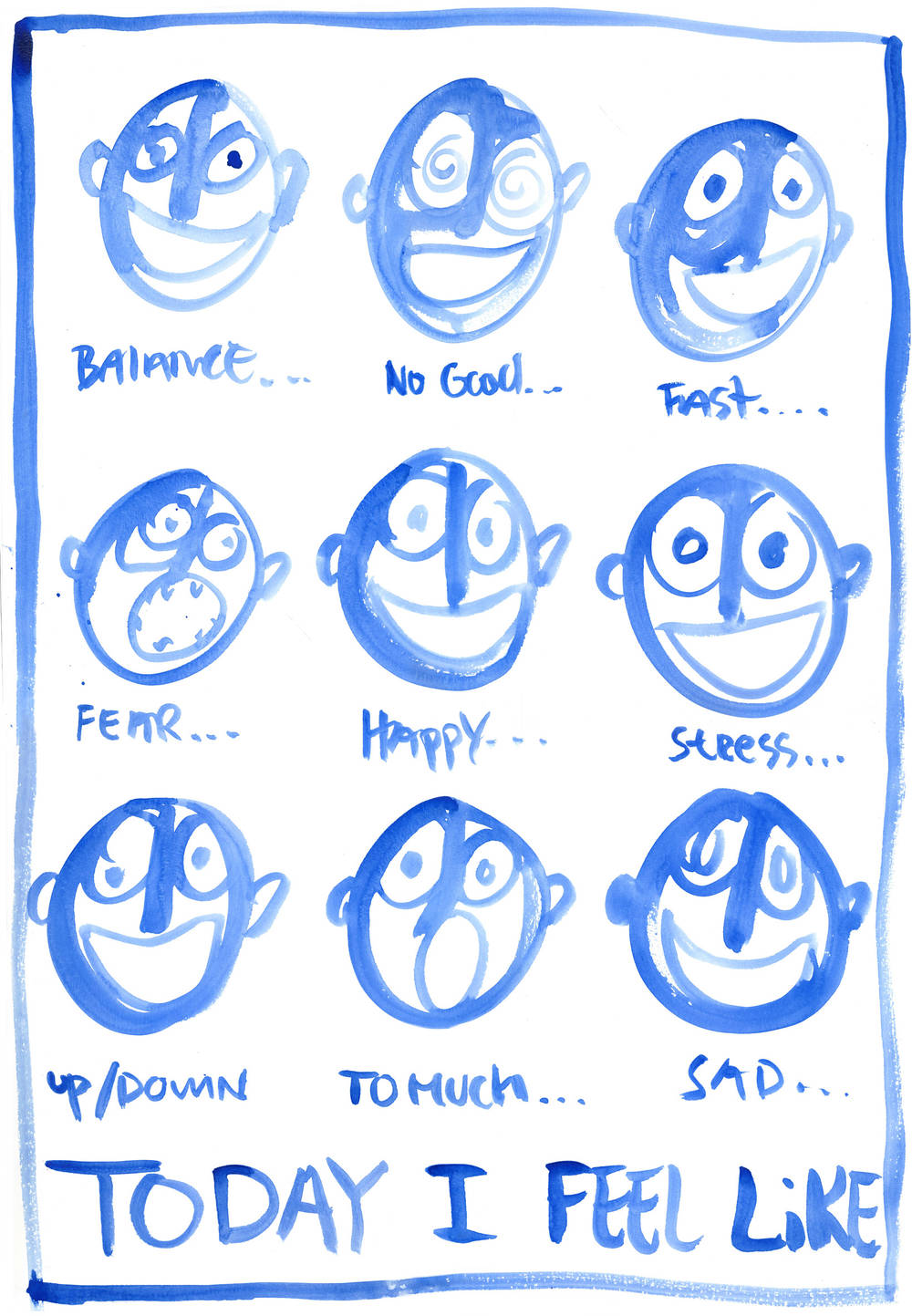
Jeppe Hein, Today I feel like..., 2020
In a diary the Danish artist Jeppe Hein documents his mood in form of a spontaneous self-portrait. In their simplicity, the blue watercolors express happiness, sorrow, curiosity or relaxation. In August, the artist invites visitors of the Schirn to become aware of their own world of feelings and thoughts and to visualize their emotions using blue color on white ground.
Pablo Picasso, Femme aux Bras Croisés, 1901/02
When we talk about the “Blue Period” of an artist, then one name inevitably comes to mind: Pablo Picasso, the Spanish wunderkind of the art world, who developed his first independent style at just 20 years old and who revealed a propensity towards a melancholy mood – his “Blue Period” (1901-1904), for example, focuses primarily on subjects of human misery – that later lifted with the advent of his “Rose Period” around 1905/06.
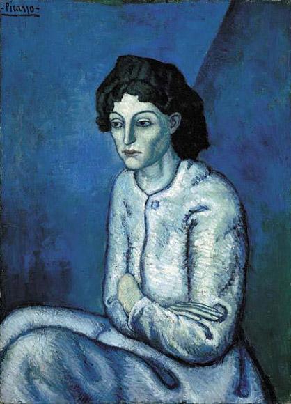
Pablo Picasso, Femme aux Bras Croisés, 1901/02, Image via Wikimedia.org
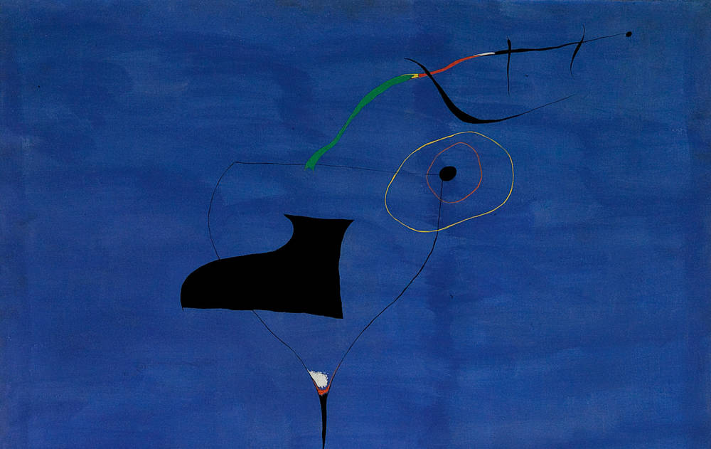
Joan Miró, Painting (Figures: The Fratellini Brothers), 1927
In the same way Joan Miró wanted to avoid setting out a specific artistic style, he also frequently switched color palettes. Blue, however, was to play a significant role in his career, as his blue “dream paintings” (1925-1927) consolidated Miró’s fame and the color accompanied him through decades of creativity.
Goshka Macuga, The Nature of the Beast, 2009
Goshka Macuga processes snippets of history in comprehensive art installations. For “The Nature of the Beast” for example, the artist makes use of the setting in which former American Secretary of State Colin Powell gave a speech before the United Nations Security Council in 2003 that aimed to justify the deployment of US troops in Iraq. Ironically, in the background we see Picasso’s “Guernica”, the quintessential pacifist painting of the modern period. The painting has been summarily covered with a blue cloth, and is framed by the official flags of the Security Council.
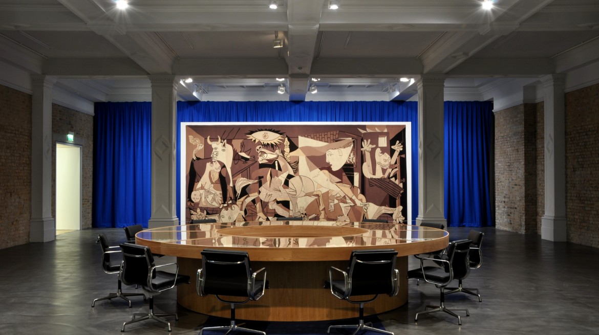
Goshka Macuga, The Nature of the Best, Installation view, The Bloomberg Commission, Whitechapel Gallery, London, 2009, Courtesy of the artist; Andrew Kreps Gallery, New York; Kate MacGarry Gallery, London; Galerie Rüdiger Schöttle, München; und Whitechapel Gallery Archive, Foto: Patrick Lears, Image via Whitechapel Gallery
Irma Blank, Avant-testo, 25-3-2000, 2000
Irma Blank creates abstract images using one color particularly frequently: blue. In miniature and with bright tones, or as in “Avant-testo, 25-3-2000”, for which she used a ballpoint pen to create a dense network of color with circular movements on polyester, which is equally reminiscent of both the sky and the sea.

Irma Blank, Avant-testo, 25-3-2000, 2000, Ballpoint pen on polyester on wooden stretcher © Copyright the artist | Courtesy Alison Jacques Gallery, London, Image via s3.amazonaws.com
Yves Klein, Blue Monochrome, 1961
Another “master of blue coloration” is Yves Klein who, after marveling at the blue of the frescoes in the Basilica at Assisi on a trip to Italy, began working on his first monochrome paintings. It was from this that the so-called “monochromes” developed, which he increasingly produced in monochrome ultramarine-blue. In 1960 Klein even had this color patented under the label “International Klein Blue (I.K.B.)”.

Yves Klein, Monochrom Blue, 1961, Dry pigment in polyvinyl acetate on cotton over plywood, Image via Wikimedia
Leonardo da Vinci, Virgin of the Rocks (Second Version), 1493-1495
Mary, clothed in a blue gown – as she is seen in countless representations from the Middle Ages. Wearing a dress in what was then a hard-to-acquire and valuable color, the Virgin Mary thus becomes recognizable, as in the second version of the Virgin of the Rocks by Leonardo da Vinci.
.jpg/330px-Leonardo_da_Vinci_Virgin_of_the_Rocks_(National_Gallery_London).jpg)
Leonardo da Vinci, Virgin of the Rocks (Second Version), 1493-1495, oil on wood, National Gallery, London, Image via Wikimedia
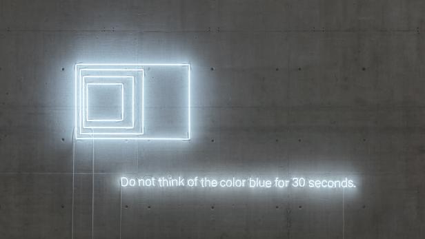
Sylvie Fleury, Do not think of the color blue for 30 seconds
“Do not think of the color blue for 30 seconds”, writes Sylvie Fleury in milky-white neon on the wall – and by now at the latest every observer should unavoidably be seeing nothing but blue.
Sylvie Fleury, Do not think of the color blue for 30 seconds, Installation view, Kunsthalle Vienna, 2015, © photo: Stephan Wyckoff, Image via kurier.at
Katsushika Hokusai, The Great Wave off Kanagawa, from the series “36 Views of Mount Fuji”, approx. 1830
Katsushika Hokusai was so keen on the synthetic Prussian blue ink imported from Europe which – in contrast to natural Japanese colors – did not blister so quickly, that it dominates the entire Fuji series (1830-1836). A series that was sold to its publisher as “single sheets in blue” in 1831 and which includes “The Great Wave off Kanagawa”, a work considered the world’s best-known piece of Japanese art.

Katsushika Hokusai, The Great Wave off Kanagawa, from the series “36 Views of Mount Fuji”, approx. 1830, woodblock print, Image via Wikipedia
Franz Marc, Blue Horses, 1911
“The deeper the blue becomes, the more strongly it calls man towards the infinite, awakening in him a desire for the pure and, finally, for the supernatural”, the artist behind the “The Blue Rider”, Wassily Kandinsky, once said. At the same time, from the brush of his friend and fellow campaigner Franz Marc came one of the best-known series of works from the group of artists, which take an Expressionist approach in detaching themselves from naturalistic coloring: hence the blue horses.

Franz Marc, Blue Horses, 1911, oil on canvas, Walker Art Center, Minneapolis, Minnesota, Image via Wikimedia
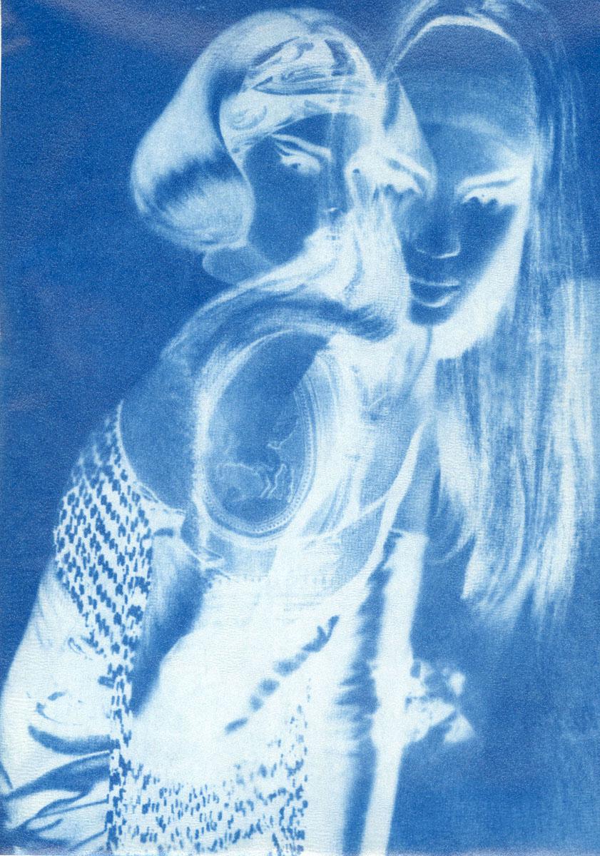
Birgit Jürgenssen, Untitled (series), 1988/89
Between 1988 and 1989 Birgit Jürgenssen worked intensively with cyanotype, also known as blueprint, an old photographic printing process that uses the cyan-blue color tones that give it its name, and which was being used in photography as early as 1842 by the botanist Anna Atkins. In the cyanotypes the subject does not appear sharply contoured, but instead white, two-dimensional silhouettes appear against the blue background, with which Jürgenssen applies her variation to the traditional presentations of a portrait.
Birgit Jürgenssen, Untitled (series), 1988/89, cyanotypie, Courtesy of the artist, Image via birgitjuergenssen.com