
From cave painting to the Facebook stream: Style in advertising, design and art
Some pictures are exciting, others aren’t. Some are art, some are advertising, others were perhaps drawn by a small child. But regardless of whether we are seeing a picture because someone has sold access to our consciousness for a few cents or because a good friend has posted it on our profile: images now have little time to grab our attention.
Every day subtle ink drawings fight fixed fights against creations of international advertising agencies in my online feed. If the algorithm actually lets a picture through, a decision is quickly taken on what we look at for longer and what immediately returns to the proverbial flood of images. We tend to dislike advertising that forces itself on us in a commercial break or through blinking gif banners. Fortunately, market research has gathered statistical evidence of that fact, which is why some agencies now promise “unobtrusive, yet effective advertising.” But what can be effective without being intrusive? Items that lure us into engaging with them rather than just being blatantly insistent.
“We are involved in what we ourselves produce,” argues reception theorist Wolfgang Iser, explaining the efficiency of blanks (Leerstellen) in novels.[1] But not only novels draw us in by leaving empty spaces to be filled, the same is true for images: we engage more deeply with them when they challenge us. If something is too simple, it is boring. If it is too difficult, we get frustrated. Psychological studies prove that we like things more when we have to work a little to understand them. Ambiguous ads that we first have to decipher get higher overall scores. We also remember them better. Evolutionary psychology links this to our learning ability: Overcoming difficulties has to feel rewarding if we are to acquire new knowledge and abilities. I think this is also why we prefer challenging pictures.
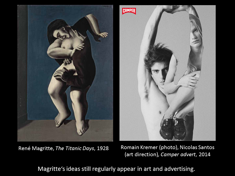
If you ask me intelligently, I am happy to deactivate my ad blocker, which otherwise removes adverts from a page. We are not just “eyeballs” or consumers with a price tag, we appreciate being surprised and challenged. Which is why Magritte is also so successful – and Magritte smartphone covers, bags and coats not only sell in museum shops. For years I’ve been collecting images like his. I call them “striking images” and try to understand how they differ from images we would not deign to give a second glance. Currently I am working on a book on the theme with artist Vincent Broquaire.
Striking images: From intuition to experiment
Images that make us take a second glance often rely on the same principles, quite regardless of what culture or era they are from. Advertisers make use of these principles, as do artists and cartoonists, sometimes quite consciously, other times intuitively, and the principle I will discuss here can be found in Persian painting from the 12th century, in Brueghel, Saul Steinberg and in contemporary comics such as Asterios Polyp by David Mazzucchelli. Such continuities are generally overlooked by both the historical and the cultural sciences for the simple reason that they are a-historical and cross-cultural. Only a general image theory can adequately describe them.
For many years, I treated the question of striking images with traditional methods, using mainly my own observations and literature research. Since last year, I am also studying picture perception experimentally in the lab for Cogntive Research in Art History (CReA) at the University of Vienna where I have project on pictorial storytelling. Showing pictures to participants from different backgrounds and learning about their interpretations has been very enriching and led me to question quite some assumptions.
So how does a work captivate us? If a picture wants us to take a second look, it is a good idea for it to surprise us. And we are surprised when an expectation is either disappointed or surpassed. In fact, we only ever become aware of most expectations when this happens.
It follows that striking images are also images which ex negativo clarify which expectations we associate with images.
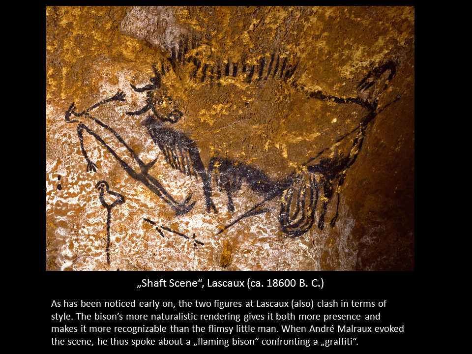
I here want to introduce two principles for the creation of striking images. Both are linked to style: I call them “style clash” and “subject specific style”, respectively. They oppose the expectation of unity of style at two different levels. The first one first occurred in images over 20,000 years ago in the caves of Lascaux (fig. 1) and has since cropped up in different cultures and contexts, taking on a variety of meanings.
How advertising influenced Magritte
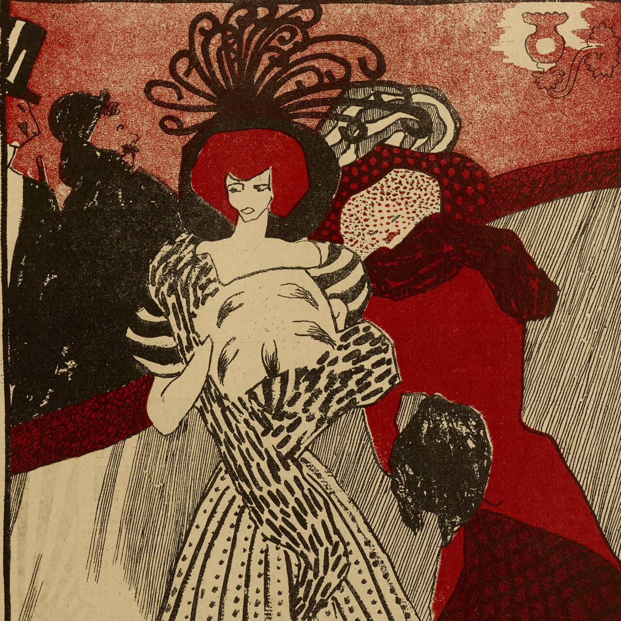
The reason why I talk about it here and now is the René Magritte exhibition at the SCHIRN (for which I also wrote a catalog essay). Magritte was indeed a master of striking images and it is thus no wonder that many of his picture ideas were directly or indirectly taken up by other artists as well as advertisers (fig. 2). Indeed a number of firms recognized the potential of his imagery as early as at the 1920s and engaged the master himself to illustrate and design publicity materials (fig. 3). This led to an interesting situation where Magritte not only influenced advertising, but was also influenced by it.
As art historian Georges Roque demonstrated, several of the principles and motifs that would later become essential for Magritte’s art first appeared in the advertisements he designed.[2] A series of ads for the Belgian fashion house Norine indeed forms the missing link between Magritte’s Cubist phase in the early 1920s and the naturalistic (or “close to perception”) style he used when he was famous. As Roque argues, Magritte often had to depict the product (say, a dress or a coat) in a way that was clearly recognizable. To achieve this he regularly painted products in a naturalistic style. However, as he initially painted the rest of the image in the Cubist style, there was a style clash between the product itself and the background.
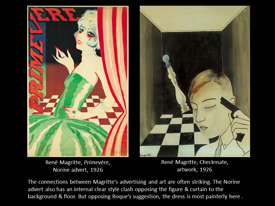
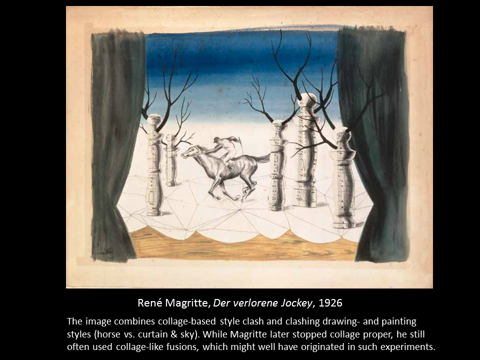
In the same year this contrast also starts to appear in his art (figs. 3, 4). In many images from 1926 onwards some visual elements are treated in a very painterly manner so that the brushstroke remains visible, while others are painted so naturalistically that the depicted object is more visible than the depiction. Sometimes Magritte even cut out sections of photos or musical scores and inserted them in his paintings, which further reinforced the stylistic contrasts between various elements.
As this kind of mix scarcely appeared later, it might indeed have been a transition phenomenon as suggested by Roque. His choice to abandon it can be linked to an observation which I mention in my catalogue essay: Magritte understood that non-naturalistic styles weaken the appeal of his surrealist imagery because they draw attention to the painterly form and thereby reduce, as he says, the “shock” of the depicted situation. The less painterly his paintings are, the more they seem to be realistic depictions of a strange world – which is what he wanted them to appear like. And yet the combination of two styles in the same painting contributes to the appeal of Magritte’s early works.
Style and genius: Style as the man himself
The expectation that images as well as artists have homogenous styles seems to be closely connected with our understanding of artistic development and our concept of genius. For example, we tend to talk of artists “finding” their style rather than choosing it. Style is typically understood as something that directly expresses someone’s personality. Talking of “signature style” we seem to suggest that painting styles are as individual as signatures and that they could be linked to personality traits like our handwriting is.
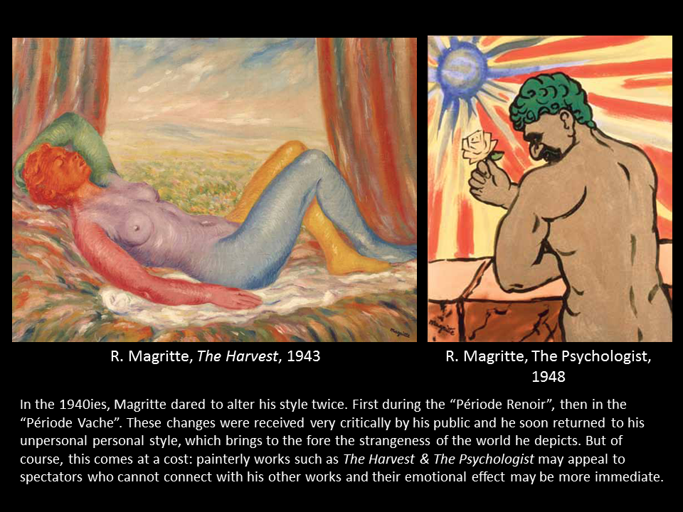
Thus we are denying the difference between creator and work when we say “This is a Van Gogh” (a Schiele, a Munch, a Kollwitz, etc.), and we would probably be troubled if we realized that Van Gogh deliberately chose the thickly layered brushstrokes and bright colors typical of his signature style. Choosing – rather than finding or developing – a style seems to be the kind of thing epigones or, worse, forgers do. If several styles occur in one picture we often interpret it as “experimental” or as an indication of the artist’s immaturity. Associations between artists and their form of expression can be so strong that they get locked up in a style by their audiences. Thus when Magritte altered his style to a kind of neo-Impressionism in the 1940s, during his Renoir and Vache periods (fig. 5), he was criticized by his collectors, critics and fans, until he finally returned to his impersonal personal style.
Similarly, Rembrandt and Titian were humiliated for their late styles by their contemporary public and were only rehabilitated after many years.
Therefore not allowing oneself to be locked in a specific style and consciously varying one’s style demonstrates courage and considerable creative liberty, because style is the basis of an artist’s recognizability and what defines him or her as a brand. Wanting to own “a Schiele” normally means wanting to own a painting everyone recognizes as being by Egon Schiele. The idea of style as the natural expression of someone’s view of the world or is often associated with a quote by Buffon from 1753: “Le style est l’homme même” (“The style is the man himself”). Ludwig Wittgenstein gave his own interpretation of this idea in 1949: “It says that a man’s style is a picture of him.”[3] This would make the style of a picture a picture of its creator. To my mind, all of this is at best a myth or superstition and at worst, part of artists’ brand management. As not only Magritte proved, a great artist can be one who consciously opts for a style. Even among the Expressionists not everything is a direct expression of personalities.
Subject specific styles vs. style as a filter
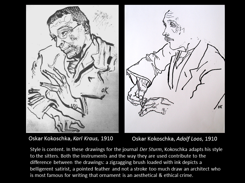
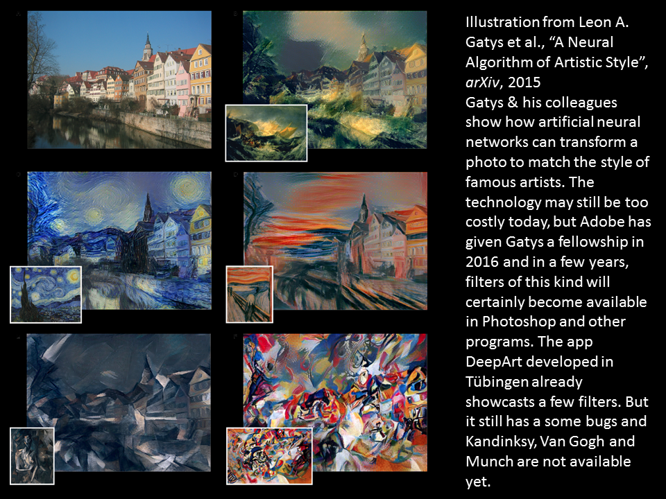
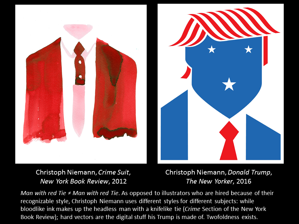
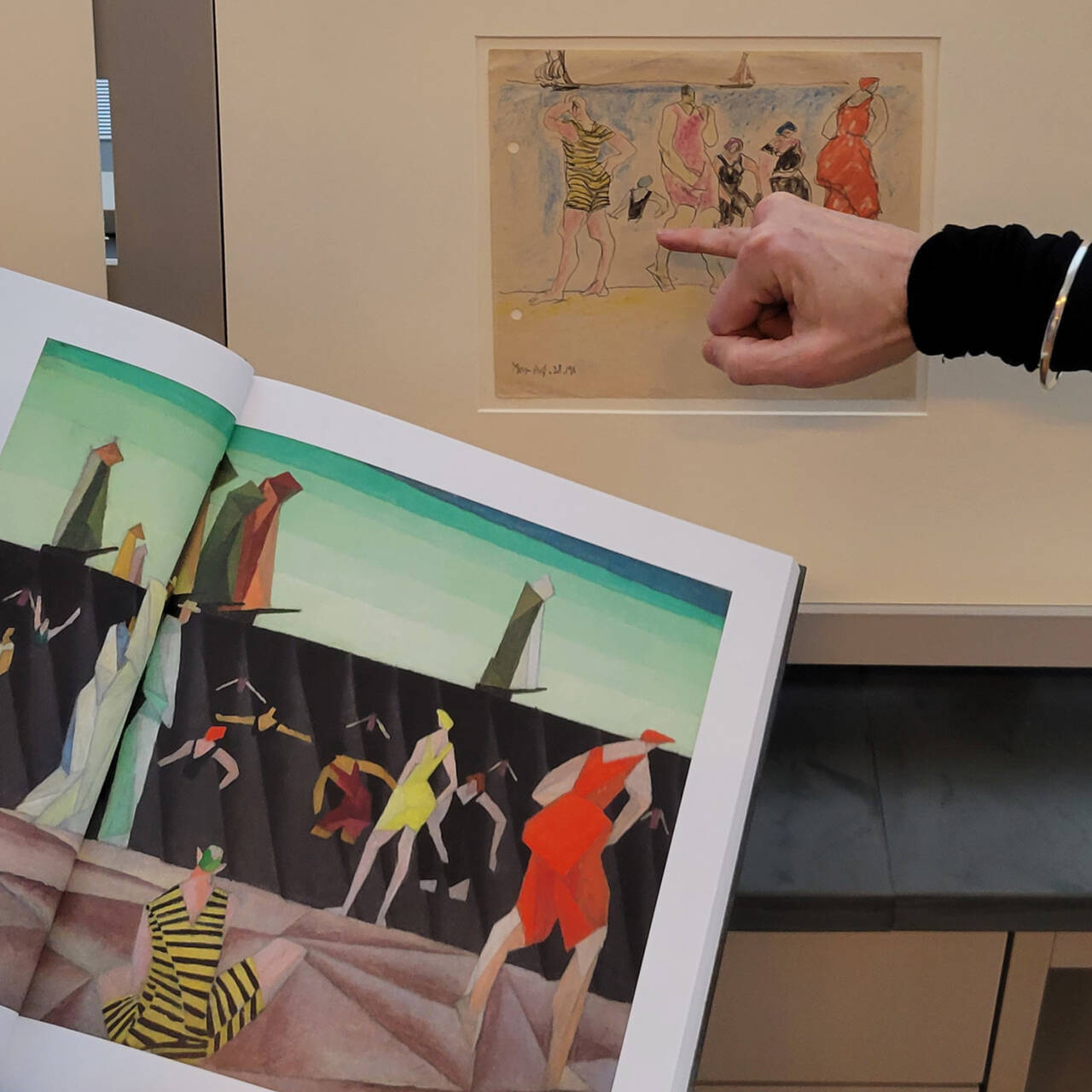
Let us look at two portrait drawings (fig. 6) by Oskar Kokoschka from 1910. I usually have to point out the signature (“OK”) to my students or else they don’t believe them to be works by one and the same artist. This is because as opposed to artists who simply subject their sitters to a signature style “filter”, Kokoschka adapted his style to the people he was drawing. Style as a filter can be so mechanical that home computers have been able to turn a photo into something that looks like a Warhol since at least 2002. And a study with deep neural networks from University of Tübingen (fig. 7) announces Van Gogh, Kandinsky or Munch filters to come. Rather than just applying a signature style filter for these two portraits of people who were dear to him, Kokoschka did something very different: he chose to adapt his style to his subjects. In other words, he did not place the focus on himself, but on his topic. When two styles are not opposed within a work but styles are chosen for specific topics, I call this “subject specific style”. This is something we now mostly associate with applied art. But what makes an artist like Christoph Niemann interesting to me is the fact that he regularly modifies his style to suit different tasks (fig. 8). It’s thought rather than craft that counts in his work. Unlike, say, a new creation by Ray Pettibon, Niemann’s creations surprise us not only through new contents, but also through news forms. When this is well done, form and content become one: thus Niemann’s work for the crime column doesn’t have to have a violent content, the pool of red watercolor tells us what it’s about. When it follows content, form becomes part of it.
A classic piece of graphic design from 1964 formulates this vision in manifesto-like words: “The withdrawal of the designer behind the idea, the topic […] is the joint pursuit of the best forces in the field of architecture, industrial design, furniture design, photography, and graphic design. We consider the promotion of this development our most important task.”[4] This expresses what we can call an “aesthetics of serving” which abandons the “me, me, me!!” typical of so many artists to give more room to the subject. This is also the aesthetics that guided Dieter Rams, chief designer at Braun, when he declared: “Good design is unobtrusive.” Subject specific style thus illustrates one of Wittgenstein’s more difficult assertions: “ethics and aesthetics are one”.
Let us return to “free art” one last time to see this point more clearly: “A poem or aphorism”, says the writer Karl Kraus, is not simply “‘a successful form,’ in which poets enjoy wrapping their already-complete thoughts, or their already-presentable feelings to provide enjoyment for the observer.” It is about “finding words which fit the problems in the world so well that it seems like they had been solved by the writer”[5]. Creators like Karl Kraus, Dieter Rams, Christoph Niemann, or Oskar Kokoschka show that adapting style to subjects is very much reconcilable with a strong and identifiable voice.
[1] Wolfgang Iser, Der Akt des Lesens, (Wilhelm Fink Verlag, Munich, 1976), 211 (trans.)
[2] Georges Roque, “Des images qui font penser ou dépenser,” Art & Pub, Editions du Centre Pompidou, (Paris, 1990)
[3] Ludwig Wittgenstein, Culture and Value, ed. G. H. Von Wright (in collaboration with Heikki Nyman), trans. Peter Winch, (Oxford, 1980), 78e
[4] Josef Müller-Brockmann, Gestaltungsprobleme des Grafikers, (Arthur Niggli, Teufen, 1964), 6 (trans.)
[5] Karl Kraus, Die Fackel, 345/346, Karl Kraus, 1912, 36 (trans.)
5 questions for Mary Messhausen and proddy produzentin
With the performance "Thonk piece: Hungry for Stains", drag queens Mary Messhausen and proddy produzentin will open the exhibition COSIMA VON BONIN....
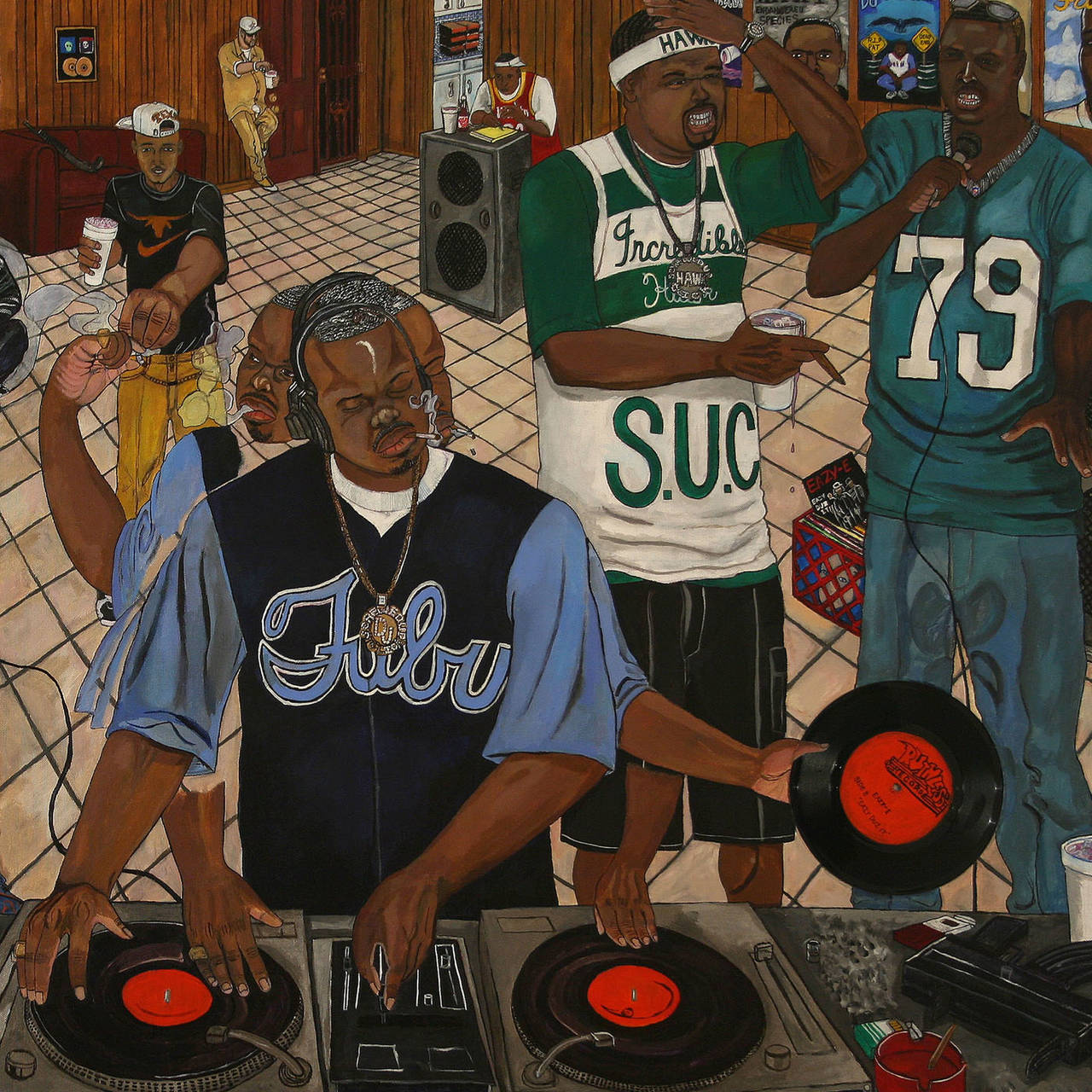
HIP HOP IS BLACK CULTURE – NOT THE OTHER WAY AROUND
Hip hop’s 50th birthday is an occasion for us to listen to some old records and mixed tapes and to look back at the most important hip hop films of...
Now at the SCHIRN:COSIMA VON BONIN
The SCHIRN is showing a unique presentation of new and well-known works by COSIMA VON BONIN until June 9.
You Get the Picture: On Movement and Substitution in the Work of Lena Henke
The artist LENA HENKE already exhibited in the SCHIRN Rotunda in 2017. What are the secrets of her practice and where can you find her art today?
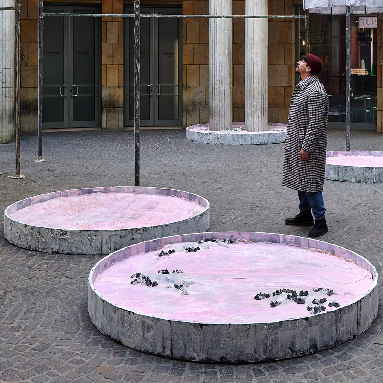
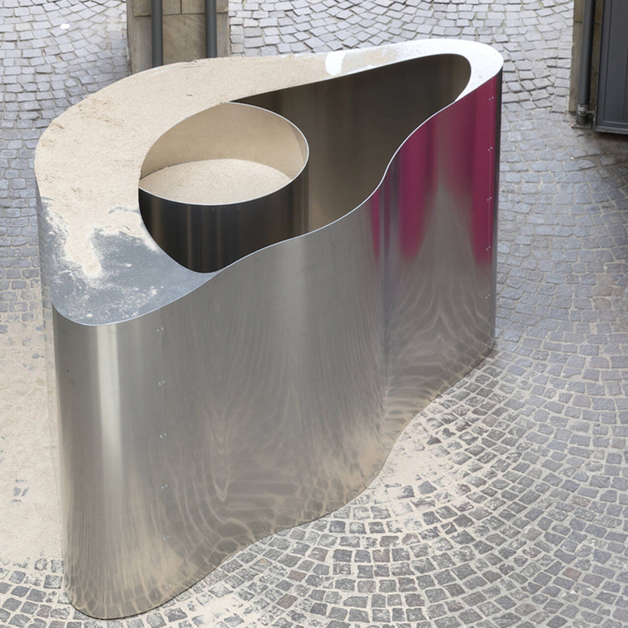
SHALLOW LAKES – plumbing the depths
In the SCHIRN’s rotunda, MELIKE KARA is presenting a series of sculptures that are reminiscent of bodies of water or small lakes. So, what’s this...
When subculture becomes mainstream – a balancing act
Regardless of whether it is hip hop, techno, or the queer scene: It is not unusual for the aesthetics of countercultures and subcultures to morph into...
Now at the SCHIRN: THE CULTURE: HIP HOP AND CONTEMPORARY ART IN THE 21ST CENTURY
Coinciding with the 50th anniversary of the birth of hip hop, the SCHIRN dedicates a major interdisciplinary exhibition to hip hop’s profound...
Julia Feininger – Artist, Caricaturist, and Manager
Art historians can tell us a lot about LYONEL FEININGER, but who was Julia Feininger and what legacy did she bequeath to the world of art?
Lyonel Feininger and the Harvard Art Museums. Part 2
The Harvard Art Museums host the largest Lyonel Feininger collection in the world. The directors Lynette Roth and Laura Muir chat about Feininger’s...
Five good reasons to view Melike Kara in the SCHIRN
From February 15, the SCHIRN presents a new site-specific installation by Melike Kara in its public rotunda. Here are five good reasons why it's worth...
Lyonel Feininger and the Harvard Art Museums. Part 1
The Harvard Art Museums host the largest Lyonel Feininger collection in the world. How did that happen and how was the relationship between the artist...
2024 AT THE SCHIRN
This is 2024 at the SCHIRN! From hip-hop and art in the 21st century, to Selma Selman, the self-proclaimed "most dangerous artist in the world", to...