Red is the color of love? Far from it. The pigments and shades are as varied as the manner the color red is used in art. Our Top Ten!
Red has been on our color palette since the beginning of history. As a symbol of power, love, strength, aggression, and passion it has defined our visual culture. Red is not only one of the primary colors but is also the first color humans could make and reproduce. We are familiar with red in numerous variations and pigments – from ocher, carmine, and vermilion through to scarlet and cardinal red. The pigments and shades are as varied as the manner the color red is used in art. Here’s our Top 10:
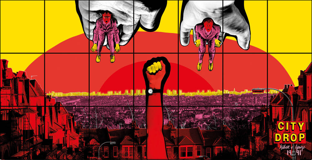
1. Gilbert & George
Red is a central color in many of Gilbert & George’s works. The two realized that red is very useful as it can be used in a wide variety of ways, namely to express danger, love, blood, and politics. Political topics repeatedly feature in their pictures and the duo relies above all on the colors black, white and red, as they once revealed in an interview:
GEORGE: And red is very useful to us, because you can use it in so many ways: you can use it for danger, for love, for blood, politically…
GILBERT: Politically, like propaganda. If you want to make a statement, you have to have…
GEORGE: Black and white and red. [...]


2. Laura Wheeler Waring, Marian Anderson, 1944
Marian Anderson, one of the outstanding opera singers of the 20th century, stands on the stage looking calm and graceful in her deep red dress, which runs down to the floor, eddying around her feet. She seems to be waiting patiently to start with her performance after the applause has ebbed. The moment was captured by Afro-American artist Laura Wheeler Waring who is famous for her portraits of prominent African Americans from the period of the Harlem Renaissance. In 1939, Marian Anderson was at the center of a historic event when the Daughters of the American Revolution organization refused to let her perform in Constitution Hall in Washington because she was Black. No less a person than First Lady Eleanor Roosevelt had to intervene, enabling the singer to give an open-air concert at the Lincoln Memorial that was attended by 75,000 people and followed by millions on the radio. This scandal brought Anderson a great deal of sympathy and became a key moment in the American civil rights movement.
Laura Wheeler Waring, Marian Ander-
son, 1944 © Estate of Laura Wheeler
Waring, Image via npg.si.edu
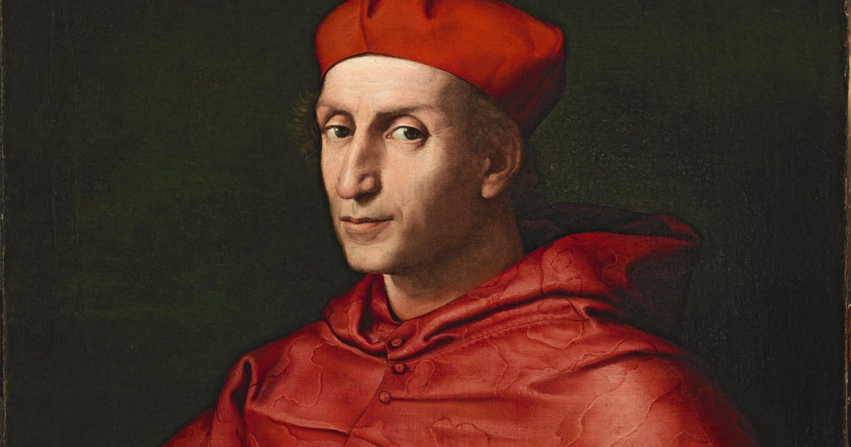
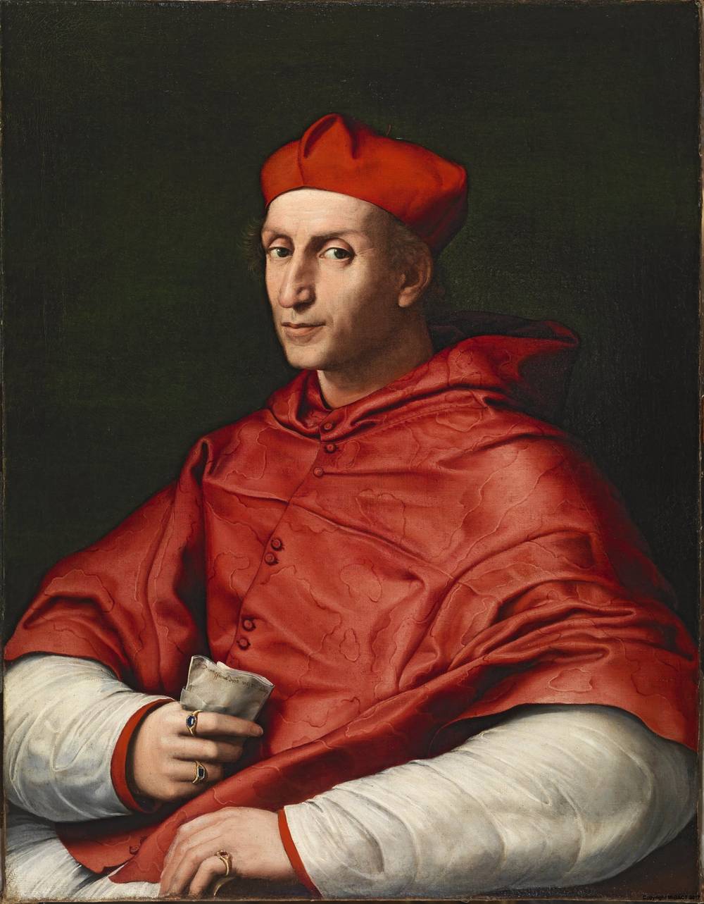
3. Raffael, Porträt von Kardinal Bibbiena, 1516
In this portrait by Raphael, Bernardo Dovizi Bibbiena is portrayed in his official cardinal’s garments consisting of a white robe and the short mozzetta cape in red silk. The color red plays an important role in Christian iconography. As early as the 11th century, the Roman Catholic church adopted the color red for the vestments of its most important dignitaries. The color referred to the willingness to sacrifice one’s own blood for Christ and the Church if necessary. Red is the color of authority that was worn by ecclesiastical and secular leaders. By selecting this color in Medieval times, kings were highlighting their God-given right to rule. For example, Charlemagne wore red shoes for his coronation and Pope Benedict is also said to have a weakness for fine, red leather shoes… Incidentally, after the monarchy was overthrown, the color was adopted by revolutionaries around the world to symbolize freedom.
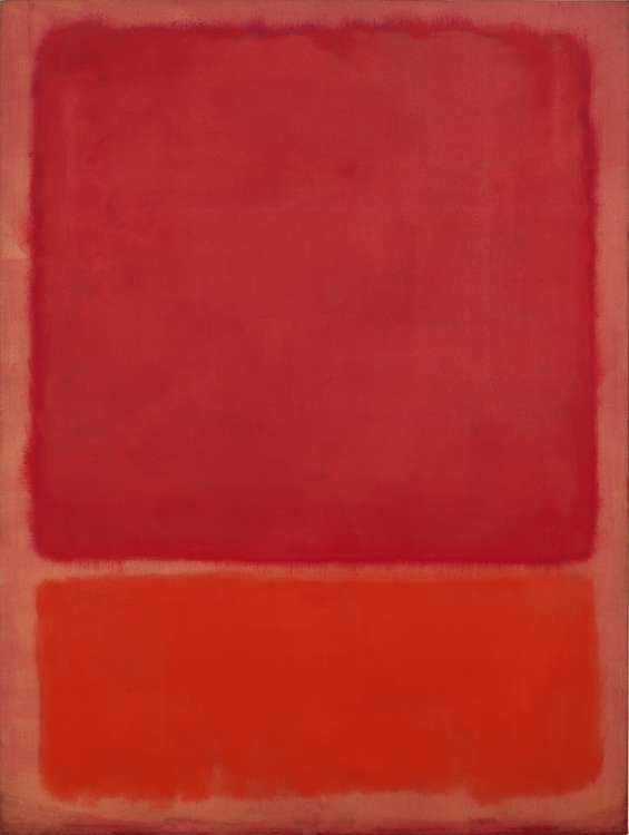
4. Mark Rothko, Untitled (Red, Orange), 1968
How do you portray “the sublime”? With his characteristic, large-format paintings comprising rectangular color fields Abstract Expressionist Mark Rothko whisks observers away into another world. The superimposed blocks of pigment in “Untitled (Red, Orange)” seem to be in constant motion, to vibrate, to pulsate – simultaneously, the predominant color red evokes elementary emotions. In terms of color and shape, Rothko’s compositions seek to evoke the metaphysical, the sublime through the observers communicating with the canvas in a controlled environment and engaging with the works.
MARK ROTHKO, UNTITLED (RED, ORANGE), 1968, © 1998 Kate Rothko Prizel & Christopher Rothko [2021], ProLitteris, Zurich / Photo: Robert Bayer, Image via www.fondationbeyeler.ch
5. Louise Bourgeois, Red Room (Parents), 1994
In her “Cells”, a series of architectural spaces and situations, Louise Bourgeois addresses general topics of human relationships that can primarily be attributed to the feelings of pain and anger. The “Red Rooms” are among the most fascinating works in this series as they graphically depict the complexities of the relationship between a daughter and her parents: They navigate the uneasy combination of intimacy and violence, pain and longing.
The “Red Room (Parents)” consists of a (marital) bed – essentially a place of closeness and intimacy that is flanked here by two marble sculptures. But a toy train and a closed xylophone box remind us of the presence of a child, and indeed the third pillow with the words “Je t‘aime” embroidered in red seems to belong to the child. She says of the color red that it is her favorite color: “It is violent. It is the color of blood. Red is the color of shame. Red is the color of jealousy. Red is the color of resentment. Red is the color of reproach.” There does not seem to be a more suitable color to portray the anger and disappointment that Bourgeois must have suffered as a child.
It is violent. It is the color of blood. Red is the color of shame. Red is the color of jealousy. Red is the color of resentment. Red is the color of reproach.

Louise Bourgeois, Red Room (Parents), 1994, Photo: Maximilian Geuter (c) The Easton Foundation / VEGAP, Madrid, Image via bourgeois.guggenheim-bilbao.eus
6. Chiharu Shiota, The Key in the Hand, 2015
The atmosphere is unreal, almost surreal. A network of threads comprising 400km of red yarn – every one of them connected to a key – dominated and ran through the Japanese pavilion at the Venice Biennale in 2015. In her “The Key in the Hand” installation artist Chiharu Shiota wrapped up familiar objects and (literally) tangled up observers in a diffuse space in which she set out to explore the question of collective memory. Before embarking on her installation Shiota called on people to give her their old keys. Now the collection of 50,000 keys wound around each other dominates the room and bundles individual recollections to a kind of global, collective memory.
Why did Shiota choose the color red? Because it not only stands for blood and consequently for human relationships but also for the connections of a society. While a single red thread initially seems invisible to the human eye in combination with other red threads it stands out more. Are we able to recognize a single piece, can we also see the bigger picture – that in the broader sense symbolizes the collective memory.
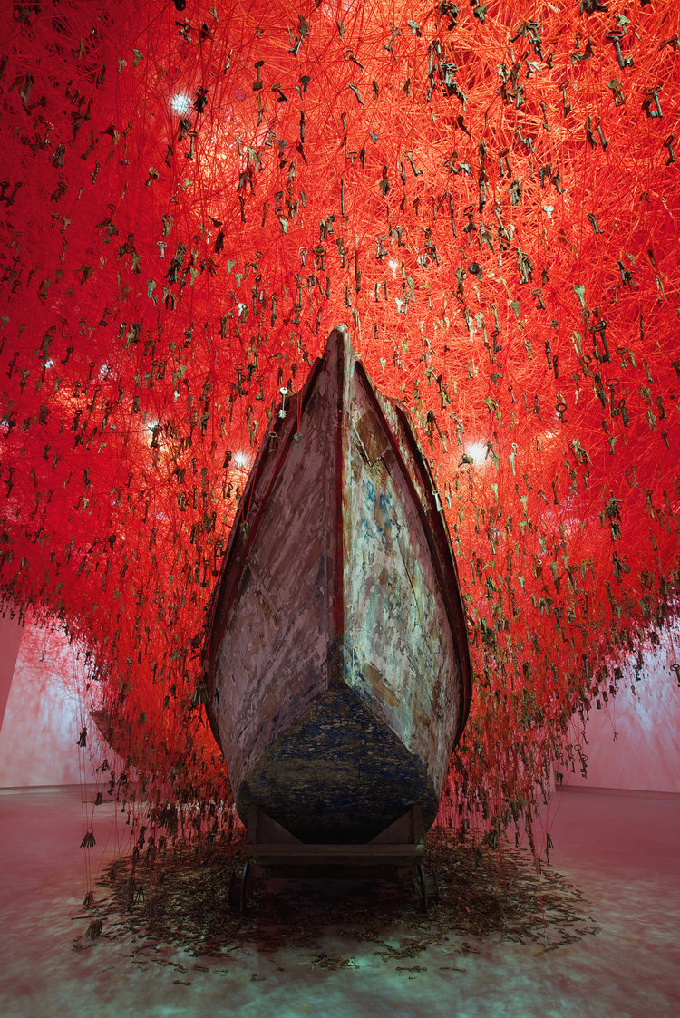
CHIHARU SHIOTA, THE KEY IN THE HAND, 2015, photo: Sunhi Mang, Image via www.chiharu-shiota.com
7. Henri Matisse, Intérieur à la fougère noire (Interior with Black Fern), 1948
“Intérieur à la fougère noire” is one of the final pictures Henri Matisse painted before devoting himself almost exclusively to “papiers découpés”. This picture is a veritable explosion of color in an interior dream with plant that would prove highly popular on Pinterest and Instagram today. The work features several different color zones next to one another, but the dominant red wallpaper with its geometrical pattern is what stands out in particular. Matisse especially enjoyed working with the bright color pigment cadmium red that is known for its true color. He was the first famous artist to use it in his works.
Fun fact: Matisse failed in his attempt to persuade Auguste Renoir to use cadmium red. Although the two men were close friends, after trying it once Renoir quickly returned to his accustomed pigment.
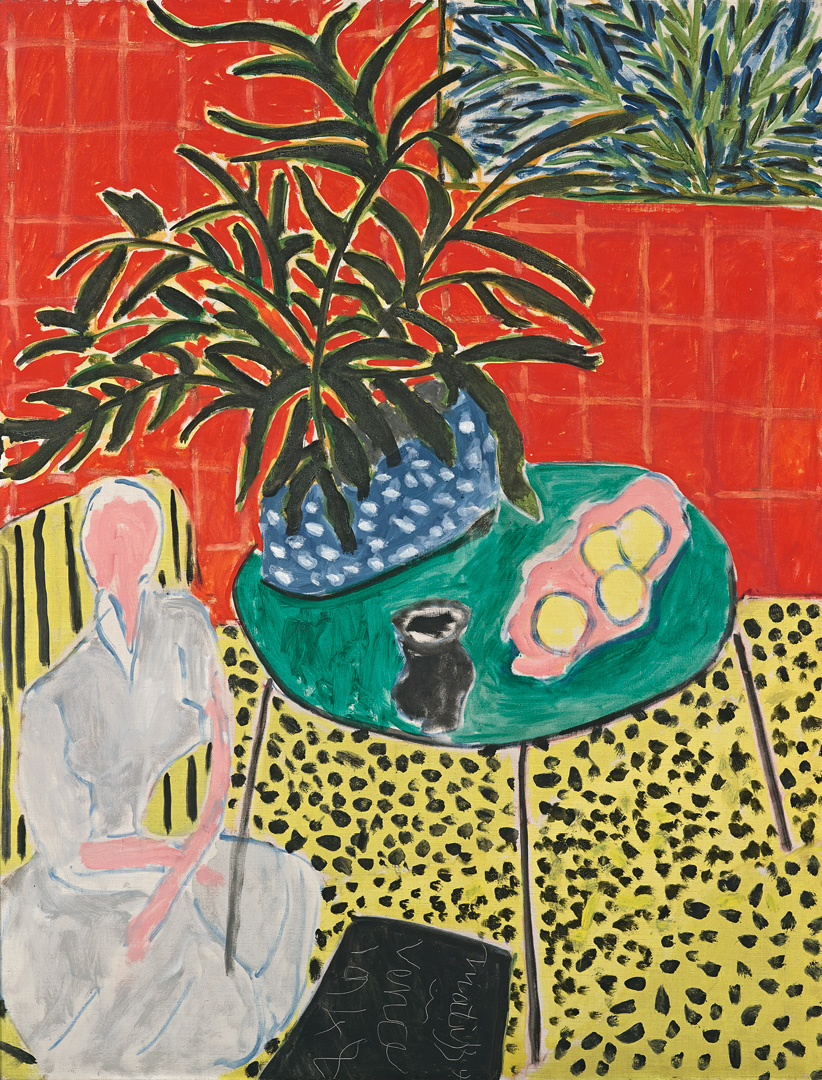
HENRI MATISSE, INTÉRIEUR À LA FOUGÈRE NOIRE, 1948 (c) Fondation Beyeler, Riehen/Basel, Sammlung Beyeler, Image via www.fondationbeyeler.ch
8. Georgia O’Keeffe, Red Canna, 1924
“I paint because color is significant.” Using extreme close-ups, American artist Georgia O‘Keeffe created a new kind of modern still-life that actually dispenses with the reproduction of realistic details. The series “Red Canna” is one of the earliest abstract depictions of flowers and is a good example of how O‘Keeffe succeeds in lending a monumental impact to natural phenomena and plants. O'Keeffe loved gardening and was often inspired by a particular flower that she then painted many times. The intensive red and orange shades are vibrant and bright – they complement each other uniquely and combined with cold white produce a special atmosphere.

Georgia O’Keeffe, Red Canna, 1924, Image via blog.singulart.com
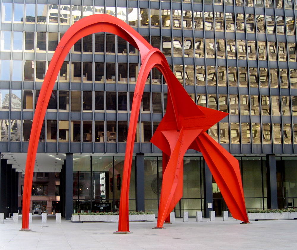
9. Alexander Calder, Flamingo, 1974
A sensation in red that breaks through the cool grayish blue of the high-rise buildings: Alexander Calder’s “Flamingo” on Federal Plaza in Chicago. Even if you don’t immediately detect a flamingo in the monumental, 50-ton heavy steel sculpture, all Chicagoans are familiar with this arresting eyecatcher in the center of the city. Despite its immense weight there is an intrinsic lightness to the sculpture that tends to act as a muting balance to the austerity of the modernist office building surrounding it – not least of all owing to its striking color.
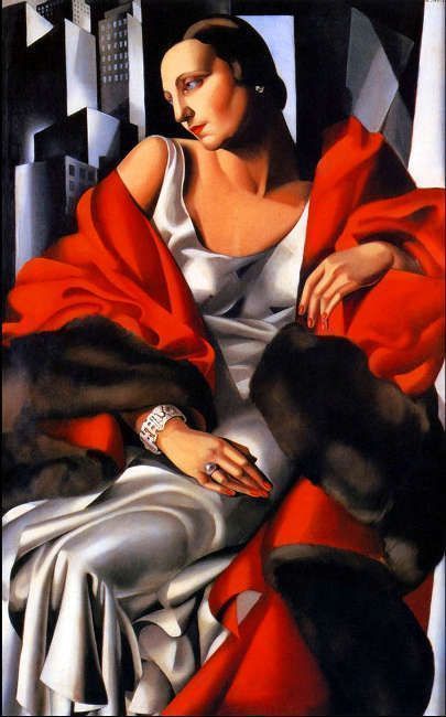
10. Tamara de Lempicka, Madame Boucard, 1931
Smooth metal, extremely long limbs, geometrical shapes and breathtaking color contrasts: In “Madame Boucard” (1931), Tamara de Lempicka demonstrates impressively that people are justified in describing her as the only Art déco artist who can be taken seriously. She experimented with cool colors and knew exactly how to depict hairstyles, jewels, flowing garments and fur stoles to portrait the new woman of the 1920s and 1930s. Madame Boucard poses like a Renaissance courtesan, her right nipple is slightly visible above the bodice of her silk dress. The red wrap draped around her body exudes so much: power, eroticism, sex appeal and, first and foremost, independence.
[Translate to English:]
Tamara de Lempicka, Madame Boucard, 1931, Image via artinwords.de